thoughts | zachary jean paradis

Everyone has thoughts.
Writing them down makes them powerful.
February 22, 2012
3 Myths of Customer Experience
I recently gave a presentation at an event organized by the the UK Usability Professionals’ Association. The event, focused on UX & Strategy, featured talks by Tom Wood from Foolproof UX, noted speaker and UX professional Leisa Reichelt as well as myself. Tom and Liesa outlined their thoughts on the definition of experience strategy and how it could (or couldn’t) be successful in companies today. With luck, they’ll both post their presentations soon.
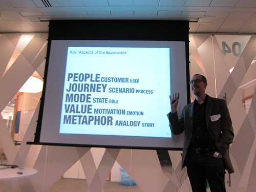
I presented a related set of ’3 Myths of Customer Experience’ which sought to address some of the biggest red herrings in UX today. Ultimately, I want to turn ’myths’ into ’truths’ and introduce my definition of Experience Strategy as well as the critical notion of the ’Aspects of the Experience’. I took the time to record a voice over for the presentation and enabled a “Screencast” within Slideshare. The total running time is just under 18 minutes. Tweet me if you have any comments or questions. Cheers.
References made within 3 Myths of Customer Experience:
You Can’t Design Experiences
Can Experience be Designed? by Oliver Reichenstein
Why User Experience Cannot Be Designed by Helge Fredheim
USER-EXPERIENCE CAN’T BE DESIGNED by MAGIA3E
Free Download: All icons from This is Service Design
Nothing is New
Everything is a Remix by Kirby Ferguson
Patent by Telautograph on Free Patents Online
Separated at Birth? by Jim Edwards on c|net
What is iPad? by Apple
What is Newton? by Apple
Creating Value through Experience Strategy & Service Design
The Business Case For (Or Against) Service Design by Brandon Schauer
Experience Strategy & Modeling
Five Questions to Build a Strategy by Roger Martin
Experience Modeling by Margaret Morris and Arnie Lund (from Sapient)
E-Lab by Christine Canabou
Boundary Objects entry on Wikipedia
IIT Institute of Design in Chicago, USA
SapientNitro, my employer and pioneer in Experience Modeling
February 08, 2012
Innovation Suicide:
10 Ways Companies Kill Their Own Good Ideas
In late November, Patrick Whitney, Dean and Professor at the IIT Institute of Design1 in Chicago gave a talk and took part in a discussion as part of Smart Design’s Smart Salon series. The talk and the discussion was focused on “Innovation Suicide” and explored the ways companies kill their own good ideas. Patrick was joined by Steve Smith, a seasoned venture capitalist interested in some of the seemingly more esoteric yet increasingly more useful ways to “value” potential in the market.
Not enough people have seen the talk (only 182 plays as of January 29!) so I wanted to promote it. For those of you who don’t have the time to watch it, I’ve captured Patrick’s “10 Ways Companies Kill Their Own Good Ideas” and commented on them each below.
Smart Salon with Patrick Whitney and Steve Smith from Smart Design on Vimeo.
Patrick counted down from number 10 to number 1 in his talk, so I’ve outlined his ten in the same order.
“There is a disconnect between the way the world is beginning to work and the lenses companies are using to run their businesses and understand consumers.” - Patrick Whitney, Dean IIT Institute of Design
Innovation Suicide: 10 Ways Companies Kill Their Own Good Ideas.
10) Send innovative ideas into the normal development process.
The “normal” product development process, as documented in typical company product management materials, is filled with stage gates and governance meant to limit risk and predict value. The problem with this notion is that ideas representing incremental innovation and those representing breakthrough innovation are so fundamentally different that they really can’t be delivered in the same way. First, we have to look at new ways to identify disruptive opportunities, then we need to spin those out as Lean Start-ups or skunkworks.
9) Do not fail early, often and cheaply.
Let’s face it, most companies don’t like to fail at all. Entrepreneurs and individuals who accept failure as a part of growth, thrive on risk and creating the new are often times those who don’t fit in corporate culture. As a result, they are marginalized or pushed out for those with “proven track records” of predictable growth. Whether focused on an incremental feature change or a “breakthrough” service, building out early versions of an innovation and failing with them internally, with partners or customers is the fastest way to bridge the gap between conjecture and reality.
8) Conduct research on existing users while ignoring non-users and extreme users.
“I think there is fraud being committed by much of the user-centered design community when we look at 5 people, 10 people, 30 people, sometime 1 person and then talk about what users will do. The sample isn’t big enough. We all know that. The value with that work is what users might do and to help people who have lots of experience make better, less conventional and wiser decisions.”
Patrick levels a bold pronouncement here at the user-centered design community. I’ve always said to my clients that contextual research isn’t about learning what all customers are doing but what some of them are doing which may suggest the future. As William Gibson smartly said, “The future is already here. It’s just not evenly distributed.” Experts need to connect a nuanced understanding of customers (and potential customers) from contextual research to macro trends and a relevant potential future for their clients and companies. At the end of the day, it’s not an isolated “fact” from user research that should drive decisions but how a fact connects to a larger story.
7) Research products instead of activities.
This may seem obvious to the initiated but is difficult to fathom for company management obsessed with their own products. Unless our goal is incremental innovation (which is a fine goal if that is specifically what we’re focused on) of our current offerings, we should be looking at people’s (note I didn’t say customer or user) values and everyday activities rather than how they use a specific product. This is especially true given a larger movement to services. Obsessing over current products will guarantee the next iteration of that it has a button in the right place, but doubtfully what the next product should be.
6) Focus on How before What.
In the 1950’s, there were a handful of toasters one could purchase at the local appliance store. Brands really “meant” something because there were very few, relatively slowly evolving products associated with each brand in each category. My grandmother still refers to her refrigerator as a “frigidaire” because it, and many other brands like it, were singular and iconic of the mid-20th-century. Times have changed radically because we can now really build anything and consumers have a paradoxical riches of choice. Enter any modern day Target or Tesco and walk to the toaster aisle: an entire aisle is needed because there are so many varieties. Do a search for “toaster” on Target and Amazon and you’ll have 180 and almost 9,000 results respectively. As a result, a shift from the “how”–the focus of traditional offering development processes–to the “what”–the focus of what we decide to develop–is more critical than ever before. What’s the point in building out yet another variation of a theme on the same product over and over again?
5) Want a delivery date and proof of success before starting.
This mistake could easily be categorized as “absurd but true”. Of course we can’t actually foretell hard dates or outcomes in a murky future! The level of detail MBA-driven financial accounting frameworks put in predicting the success of an innovation, sometimes five or more years in the future, borders on insanity. Having worked in both private and public firms, this problem is exacerbated in public firms as the focus on so-called “shareholder value” results in short-termism betraying an organization’s ability to invest in unpredictable, yet necessary for the future, explorations in new products and new markets. Good innovation planning absolutely can up the hit rate on delivering new products and services but applying predication methods–NPV or PMP–designed for relatively straight forward projects or financials just isn’t sensible.
4) Do not know that perfection is the enemy of success.
The little, but just as destructive, brother of failure is an obsession with perfection in delivering an offering to market. Unfortunately, too many people confuse sweating the details with delivering perfection across the board. The former is acceptable and necessary in the aspect of an offering where a new product or service delivers new value to customers–you’ve got to really nail it. The latter often results in bloated products filled with “features” that don’t fit together or products which never ship. Think about how the first iPhone shipped without the “cut and paste” feature. It was obvious that “cut and paste” would have made it a more “perfect” product but rather than focus on unnecessary “perfection”, Jobs, Ive and co. sweat the details on how the different functions came together in one device because that was the real value.
3) More comfortable being precisely wrong than roughly right.
“Just because you can’t count something doesn’t mean it’s not important.”
Analysis paralysis is stereotypical of modern-day corporations for a reason. Comfort with highly “precise” Excel-based decision-making has executives waiting to have answers delivered from a spreadsheet. Uncomfortable with a decision? Add a few more columns to make the analysis more robust. At the end of the day, executives need to be willing to make decisions without having all of the “facts” to prove a single direction. Pat rightfully suggests that an interdisciplinary design process, with a range of perspectives driven through quantitative and qualitative analysis and tangible synthesis, can help those same executives trust their intuition. Hard decisions are never going to be easy but they can be easier.
2) Think that transformative and incremental change are the same thing.
Companies tend to spend a lot of time refining their development process. This isn’t necessarily a bad thing. In my time at Yahoo!, we used the “PDP 2.0”; SAP had a different, yet similar, acronym and my clients since joining Sapient typically have a formalized process to bring a product or complex IT program through to fruition. In every case, the variability of those processes is pretty minimal. Similar techniques, similar measures and similar gates are used. Occasionally, something really innovative forces its way through the process, but the reality is, it rarely happens. So why don’t company leaders realize you can’t just expect innovation out of an incremental process? As noted earlier, we have to identify disruptive opportunities, then we need to spin those out as Lean Start-ups or skunkworks.
1) Want to innovate as long as it does not require change.
As Pat jokes in his talk, this is funny because it’s true. Companies are built to be optimized around a set of offerings which inherently reduces the flexibility to change. The whole point of introducing an innovation process should be to help manage the forces of creative destruction rather than having them unexpectedly manage you. Ideally, we identify and develop distinctive value so relevant to our current and potential customers that our own products, and our own organizational structures become obsolete. Innovation equals change, so you better embrace it.
Pat concludes with one major message. He says the biggest issue company’s have is that they:
“Use yesterday’s lenses to view challenges of today and tomorrow.”
By way of illustration, he introduces this “Brief history of the 20th century in one slide with no words”:

Handmade production moved to assembly lines with Henry Ford, and this disruption became the norm–everyone could have a car as long as it was black. Alfred Sloan came along and said there could be a car for every person and every purpose, and with him market segmentation and platform development moved from a disruption to the norm. Marketing and styling took over. Toyota and the Japanese focus on quality ended up being a disruption which has now spread to every other major corporation... but what is next?
“We don’t know what’s coming next. My sense is that it’s something that deals with intangibles, deals with behavior, and deals with helping companies become more comfortable in an uncertain world.”
I would say Patrick is being a little sneaky here suggesting he doesn’t know “what’s next”. He has been an active proponent of this being the current era of Continuous Innovation and a leading thinker on how to navigate situations with extreme ambiguity. I would bet he’s working on something to share in the future. We need more companies producing valuable new things and less committing Innovation Suicide.
1 It’s important to note I’m both an alumnus of the IIT Institute of Design as well as a current adjunct faculty.
February 05, 2012
First Thought: Asynchronous “Super Bowl Ads”
Living in London and being a fan of American football is a tad rough. Watching games aren’t necessarily easy given lack of access and the time difference. Also, there happens to be another kind of football which is a little more popular over here in Europe. Luckily, the Super Bowl is playing on BBC1 as my beloved Patriots look to have their sweet, yes I’ll say it, “revenge” against the same Giants team that ruined their perfect 19-0 season back in 2007. A big part of any Super Bowl is the ridiculously expensive, over-produced television commercials. Because I doubt I’ll see the US commercials here in London, I sought out the ads on the web. What I found: Super Bowl ads really aren’t for the “Super Bowl” anymore.

First off, there are multiple places you can watch Super Bowl commercials now before the Super Bowl. In fact, you’ve been able to watch quite a few of them for a week or more on FastCompany or SuperBowl-Commercials.org. The latter already has a ranking system built out for the best rated. We already have a pretty good idea of what spot will be deemed most successful.
Second, the most successful TV spot for 2011 is widely believed to be the The Force by Volkswagen. It’s an endearing and funny ad featuring a young “Darth” trying to use use “The Force” around the house with success coming only when dad’s Passat enters the driveway. I would be shocked if you haven’t seen it but not surprised at all if you didn’t see it on a television. You see, the ad really had its fullest life on YouTube where it, as of Sunday, February 5, has over 50,172,097 views. Volkswagen’s follow up this year, The Dog Strikes Back, was posted last Monday and already has over 3,800,953 views.
So, “Super Bowl commercials” really aren’t necessarily for the Super Bowl anymore. They, like many elements in our evolving multichannel experience, are asynchronous.
a·syn·chro·nous [ey-sing-kruh-nuhs] adjective
1. not occurring at the same time.
Whether a product, a service, or a piece of communication, it is now impossible to design or create touch points out of context of people’s larger experience. At a very minimum, we need to give people options for how they consume an offering. This is what most companies strive for: to enable customers to “use any channel” or “shop any where”. This is perhaps the second to lowest level of multichannel integration. I’m going to tackle levels of multichannel integration in a future post. Until then, here are my picks for the 2012 “Super Bowl” commercials.
Best Ad/Best Beer Ad: Flash Fans: 2012 Budweiser Official Big Game Commercial
Could the best spot be a beer ad which never airs in the USA?! To be aired in Canada, the commercial features two local hockey clubs playing a game which becomes “Super Bowl”-like in its intensity and emotion. Powerful stuff and a great idea by Budweiser.
Funniest Ad: "Transactions" Extended Version - 2012 Acura NSX Big Game Ad
I’m a sucker for Seinfeld–his sitcom still remains the funniest TV ever–so this extended version of him working hard to become the first owner of the new Acura NSX is a winner. We’re privileged to see the return of a few of Seinfeld’s best sitcom characters and the special, unexpected guest at the end pushes it over the top.
Best Car Ad: Chevy Sonic "Stunt Anthem" | Chevy Super Bowl XLVI Ads
Let’s face it. Super Bowl ads are all about beer, cola and cars. This car spot easily takes top billing. Chevy’s introduction of the Sonic couldn’t be any more “extreme”. The car is sent through a series of jumps, rolls, music making with the band OK Go, dives all with (insane) people in it. It also looks like the kind of really great, sporty, fuel efficient small 4-door or hatchback US auto manufacturers need to be releasing in 2012.
Best Customer Generated Ad: 2012 Chevrolet "Route 66" Super Bowl XLVI Commercial - Happy Grad
It doesn’t exactly feel “home brewed” so I’m assuming the team that made this has some serious education or experience with film. That said, it is as great or better than many of the ads featuring superstars and costing millions of dollars to make. My favorite part, the top post on YouTube: “PERFECT: For the Generation that Thinks They Deserve Every Thing For Nothing!!” by 3martijns. So true.
Most Busy Super Bowl Supermodel: Adriana Lima, the Brazilian-born Victoria’s Secret “Angel” who appears in at least two ads.
The first: Teleflora Super Bowl Ad - Adriana Lima 2012
Adriana isn’t exactly mincing words in this one: “Give and you shall receive.” I’ll leave it up to you to decide what she’s suggesting.
The second: Kia’s "A Dream Car. For Real Life.”
It’s an amusing ad documenting what goes wrong when too much pixie dream dust is dumped on an unwitting, sleeping man in his bed.
Both campaigns feature additional “added value” content on the web, including this (ridiculous) five hours worth of supermodel Adriana Lima waving a racing flag in slow motion:
Most Confusing Ad: GE (and Bud’s?) Power and beer.
I’m not sure if this spot for GE is an “official” partnership with Budweiser (I’m assuming it is) but has there ever been a more odd couple than GE and Bud? The commercial features one of the most awkward exchanges in recent Superbowl TV history: “So you guys make the beer? No, we make the power that makes the beer.” It’s a spot that makes you go, “Huh?”
I guess we always knew the Super Bowl was bigger than one day; these ads just prove it to be.
February 01, 2012
First Thought: The New Amazon
You probably didn’t notice, but there is a new Amazon in town. No, it’s not how Amazon is coming out guns blazing with Kindle Fire or how they are quietly introducing physical touch points in the US and the UK. In fact, you probably wouldn’t have noticed, because I happen to be one of the first to see it. I didn’t see it because of secret access or because I’m special, or because I happen to know a lot about retail and eCommerce. I saw it because it seems I’m the subject of some A/B or multivariate testing Amazon is currently running. Let’s review what Amazon is testing, which may come to your laptop or tablet in the near future.
First off, the biggest changes: a new visual design and home page:

The visual design is cleaner and more contemporary, feeling one part Safari and one part Google tools. The use of warm greys and understated gradients have replaced a more cartoony use of blue and orange in all of the Amazon-specific elements in the interface. Overall, these changes have quite a dramatic effect by really highlighting the merchandising slots and the products themselves, rather than drawing a customer’s eyes to the interface itself.
While the visual changes are significant, Amazon’s stripped back approach to navigation may be both more significant and more refreshing. The company has gone back and forth in extremes of showing all of their top level product categories to very few across a range of permutations. To see a detailed documentation specifically on Amazon’s navigation, it’s worth taking a quick look at the excellent overview of The History of Amazon’s Tab Navigation provided by Luke Wroblewski. I like their new approach for a lot of reasons I’ll touch on momentarily.
One final thing to mention about the new home page is their use of the “feature” space in the middle of the home page just below the tools and primary navigation. Where typically you would see one larger promotional image–generally for Amazon’s own Kindle or (worse) a giant “Letter from Jeff Bezos”–there is now the introduction of two merchandising carousels. The top carousel highlights all of Amazon’s own digital media products: the Kindle family, MP3 Store, Cloud Player, Appstore, etc. The bottom carousel has switched between three (as in the screen shot above) and two items displayed. Having just revisited the site, it’s clear that the bottom includes one personalized slot given it’s pushing a category at me that I had very recently visited. Neither the top nor bottom carousels cycle automatically. Amazon is clearly outlining top and center what they are betting their future on: their digital media and app ecosystem. Overall, their approach to introducing customers to Amazon products and promotions seems both more clear and yet more subtle than what we’ve seen in the past. The jury is out on whether it is too subtle.
Investigating the navigation and tools header more closely, we see some radical design decisions:

At rest state, none of Amazon’s departments are displayed and only a single, understated “Shop by Department” tool is shown. Pushing the visibility of Amazon’s product range out of obvious view of customers is a radical departure from other commerce sites and more extreme than Amazon has ever done before. Rolling over the “Shop by” tool invokes a set of “stacked” fly-out navigation with two levels. The first level is similar set to what Amazon has been showing recently in a static state, in a similar upper left hand position. This first level has three clearly demarcated areas: Amazon’s digital products, other common categories, and the “Full Store Directory”. It’s hard to understate the importance of this change. By placing all of Amazon’s categories behind a “Shop by Department” stacked fly-out and search, Amazon is assuming that (1) customers already know what Amazon sells, and (2) they have comfort that customers will intuitively get to products through subtle navigation, on-sites search or from general web search.
The second level, offers a combination of both text links and visual merchandising. As documented above with the Clothing category, Amazon introduces a flexible double column navigational space. In this case, it uses the left column for text links in the clothing category and the rest of the space for a large, visual for the “Resort Trend Report”. The use of a full-length woman breaking the edges of the fly-out navigation makes it feel more organic, more magazine-like and, conversely, less web-like. Different categories receive different treatments. Some have just a single column of text links and others mix text links and visual merchandising between two columns. Overall, it seems much more flexible and much more effective. I love the stacked navigation and seeing Amazon use it will help other clients see the potential value of a bit more progressive disclosure in primary navigation.
Looking across the top navigation and tool bar, we see Amazon is delivering a lot more utility and access to deeper levels of the experience:

An account pull down now (finally) offers up access to really obvious functions customers would expect to get to quickly. Orders, lists, and similar account related functions are now accessible directly from anywhere in the site. The “Your Account” area also seems to be evolving into a space to manage your digital media and Amazon cloud services. We could see this continue to grow or maybe even break off into a similar but separate tool set.
The shopping cart is also (finally) upgraded:

First off, we now have an item counter in the cart itself, clearly visible at all times. In this case, I happen to have four items in my cart so the number “4” appears in the cart. When rolling over the cart navigation, a drop-down spawns with photos, linked product item names, quantities and the ability to view cart. Pushing this type of really critical information and functionality up in the hierarchy and making it available from anywhere in the experience is an obvious move that Amazon should have already introduced years ago. If I didn’t believe in the notion of “best practices”, I would probably say this is a best practice.1
Looking deeper in the site, not much has changed in the experience outside of the visual design:

This books department page is pretty representative of the treatment for the rest of the site. While there are subtle changes, the information architecture and the visual design below the top navigation and tool bar is essentially identical to what came before it. The funny thing is, the effect is still quite dramatic. The experience feels contemporary and more useful because Amazon has driven a lot of understated power in a header which was before, most positively described as, “dated”.
Obviously this is a test so we’ll see what changes really do get rolled out in the coming days, weeks or months. We would assume there are a series of other variables or versions Amazon is testing. That said, I would argue what we do see here is evidence of definite improvement. Overall, the visual design effectively makes the experience feel more modern while simultaneously delivering a cleaner slate on which to set products and promotional opportunities. The new radically stripped back–no departments showing at rest!–navigation both depends more heavily on a user’s intuition yet also delivers greater access to deeper areas of the site as well as more effective visual merchandising. The complimentary header toolset delivers both more information and more functionality.
If these changes go live, and I believe they will, this should help prove that we don’t necessarily need to pander to “obvious” navigation or lowest common denominator interactions. Instead, we can introduce more information-rich, more useful and more responsive design which enables us to provide more power to customers with less interface junk. That said, it also shouldn’t usher in an era where other retailers seek to hide their primary departments. Amazon is a special case playing to their long-tail business model, their move to a cloud-based digital-media/app ecosystem and a legendary in site search and SEO capability. What’s great for Amazon is not necessarily great for everyone.
1 You’re probably asking yourself, “How could he not believe in best practices? Doesn’t everyone?” More on this in a later post.